
I was hired to become part of the new in-house design department of this large commercial printer. Alongside a colleague and Creative Director, we delivered design tasks for internal projects as well as pitching for new clients and working for existing ones. We liaised directly with the on-site printers to select special substrates, inks and finishes to perfect the final presentations.
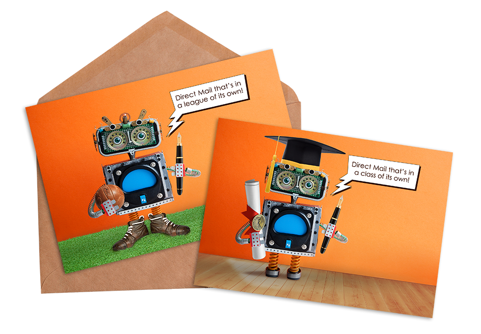
AI handwritten text greeting cards
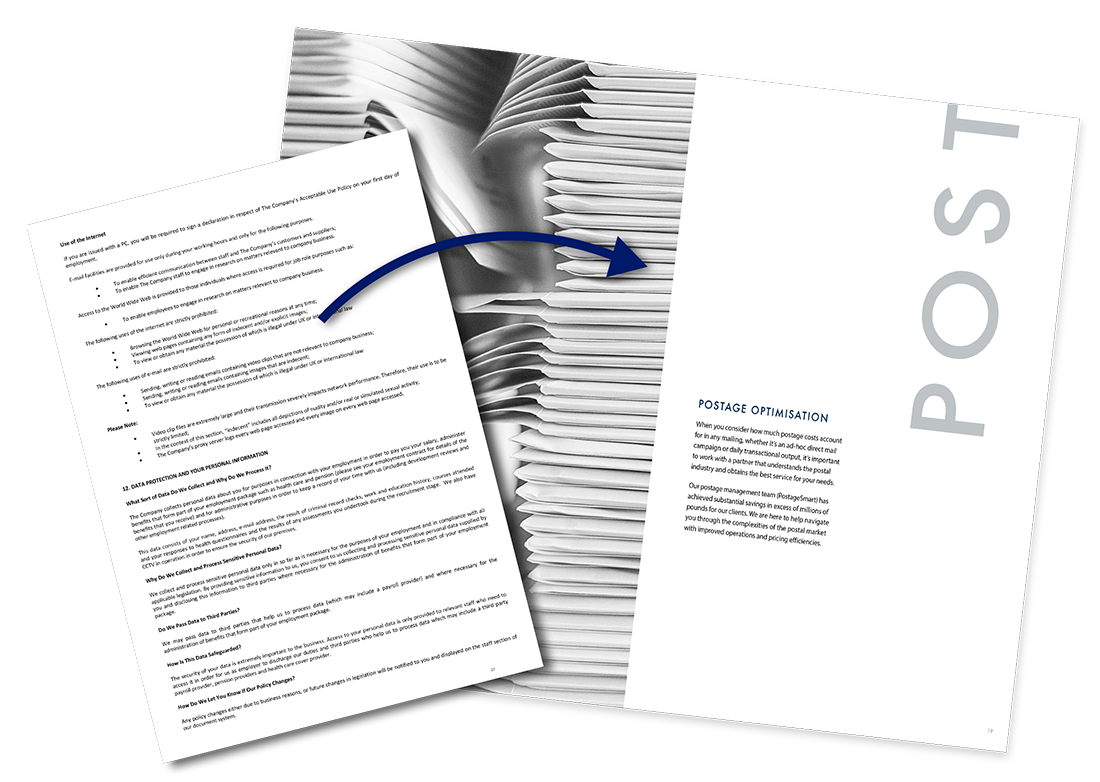
During the nine months of my contract I redesigned the employee handbook, created glossy pitch brochures, updated the brand identity, conceived a 3D company Christmas card, designed financial reports, direct mail, infographics, slide decks, social media campaigns and websites. Among the clients our team won pitches for were One Family, Riviera Travel and American Express.
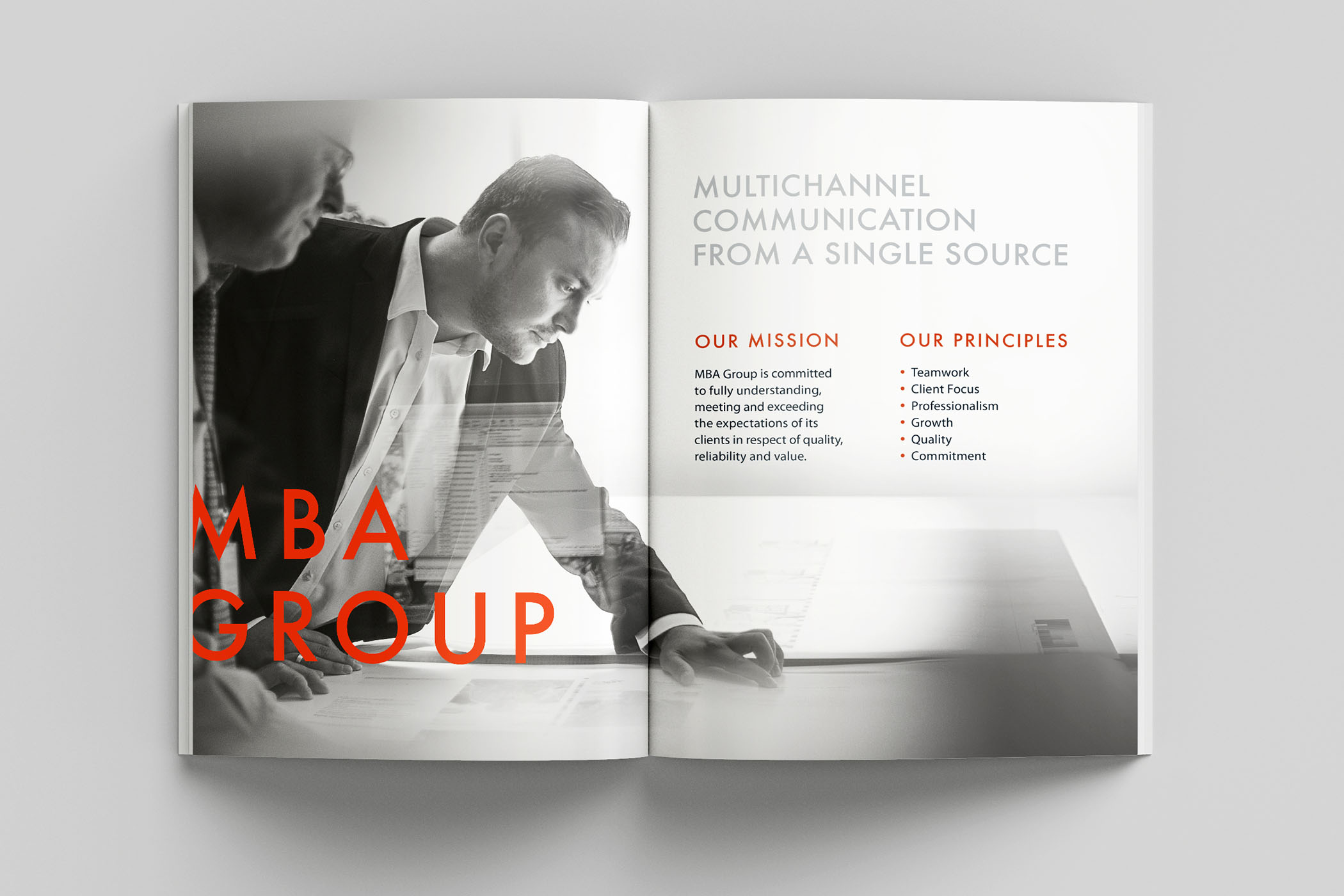
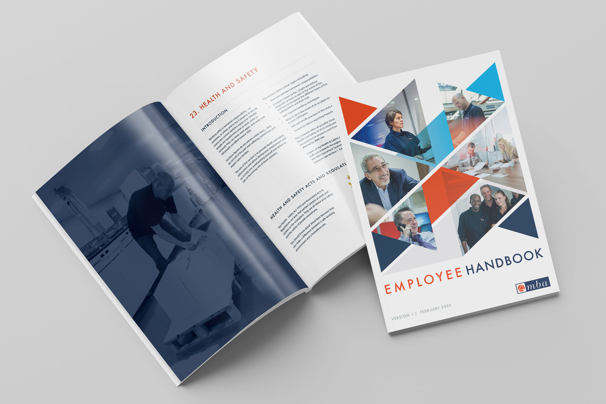
My primary in-house assignment was creating the new Employee Handbook. To start the journey I was supplied with the existing Word document comprising over 60 densely packed pages of text, and the company brochure designed to brand guidelines with glossy photographic images, large offset text and brief bursts of content amid copious white space. How to marry the two?
I met with the head of HR who owned the content, and the Creative Director. We set about solving the tricky challenge of applying the existing look and feel whilst simultaneously accommodating maximum content and minimum page count. It quickly became clear we needed to limit the number of images and amount of white space as well as the sheer volume of text.
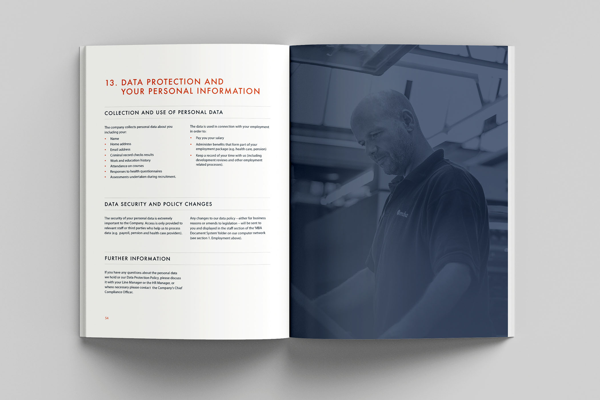
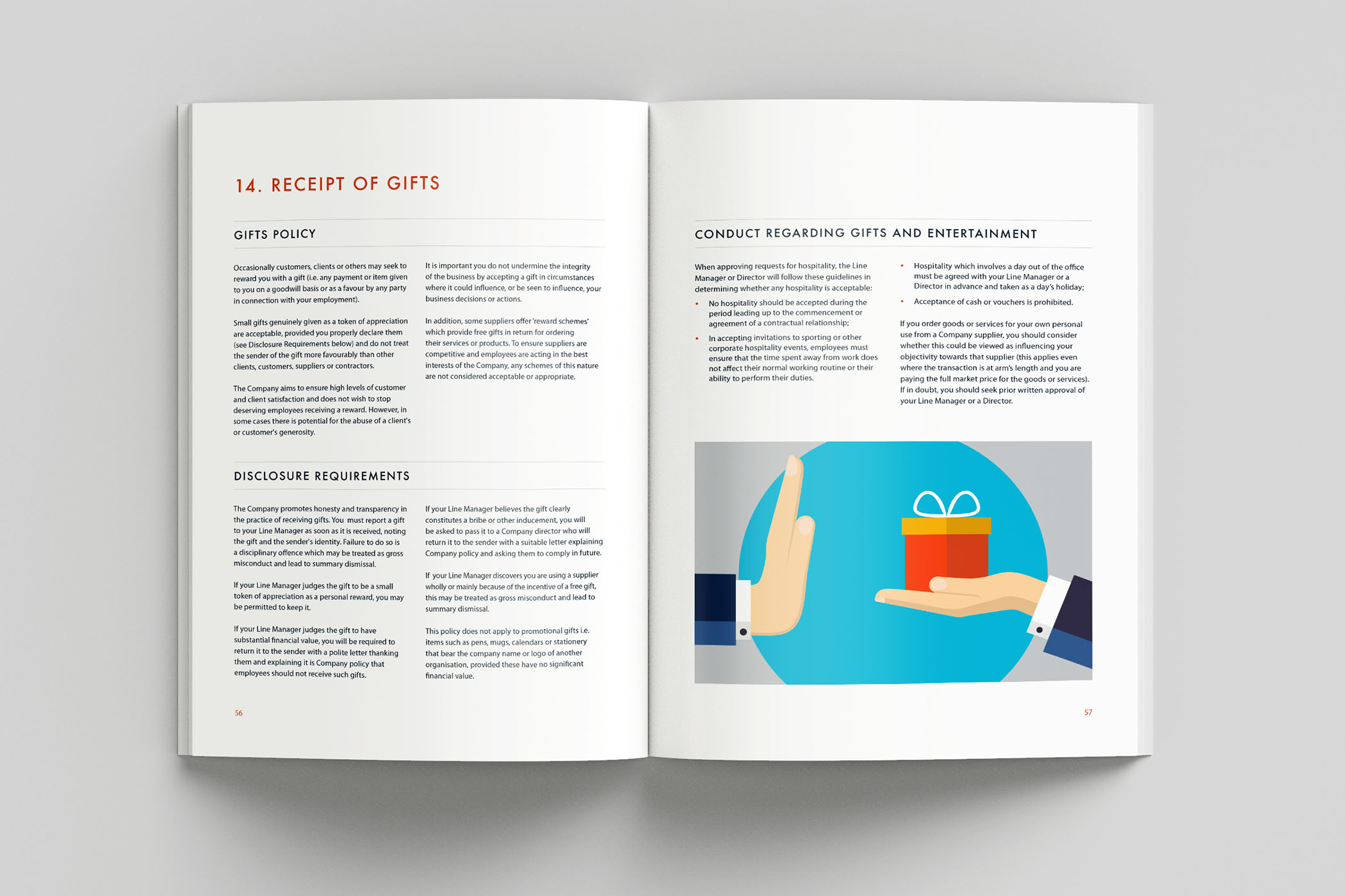
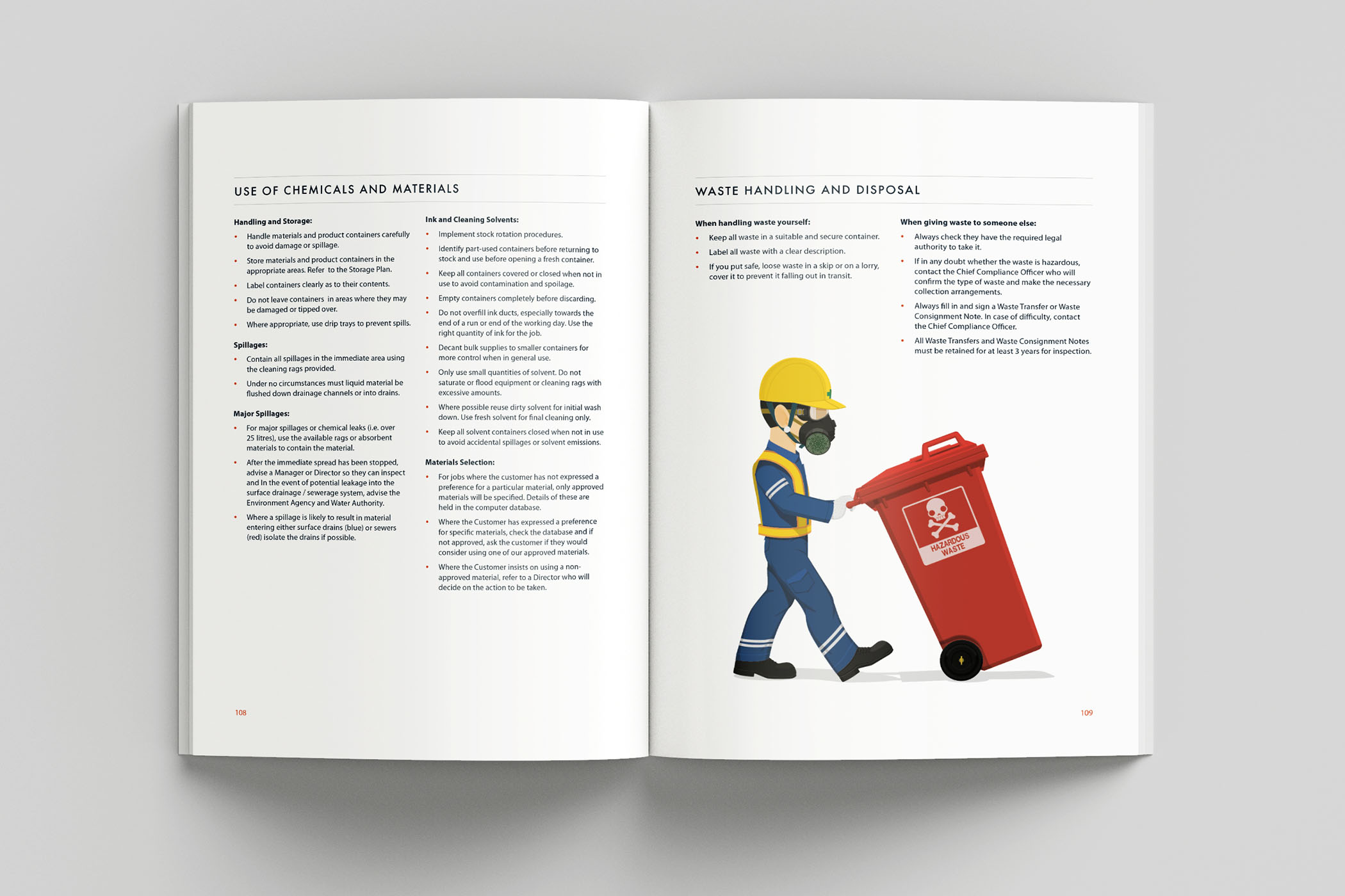
I established a typographic heirarchy comprising a two column layout with full width headings and distinct rows for each topic (and no widows!). I allowed one full page image at the start of each section, overlaid with a transparent tint in the brand’s primary dark blue. Smaller images were then utilised to fill space or illustrate text where required.
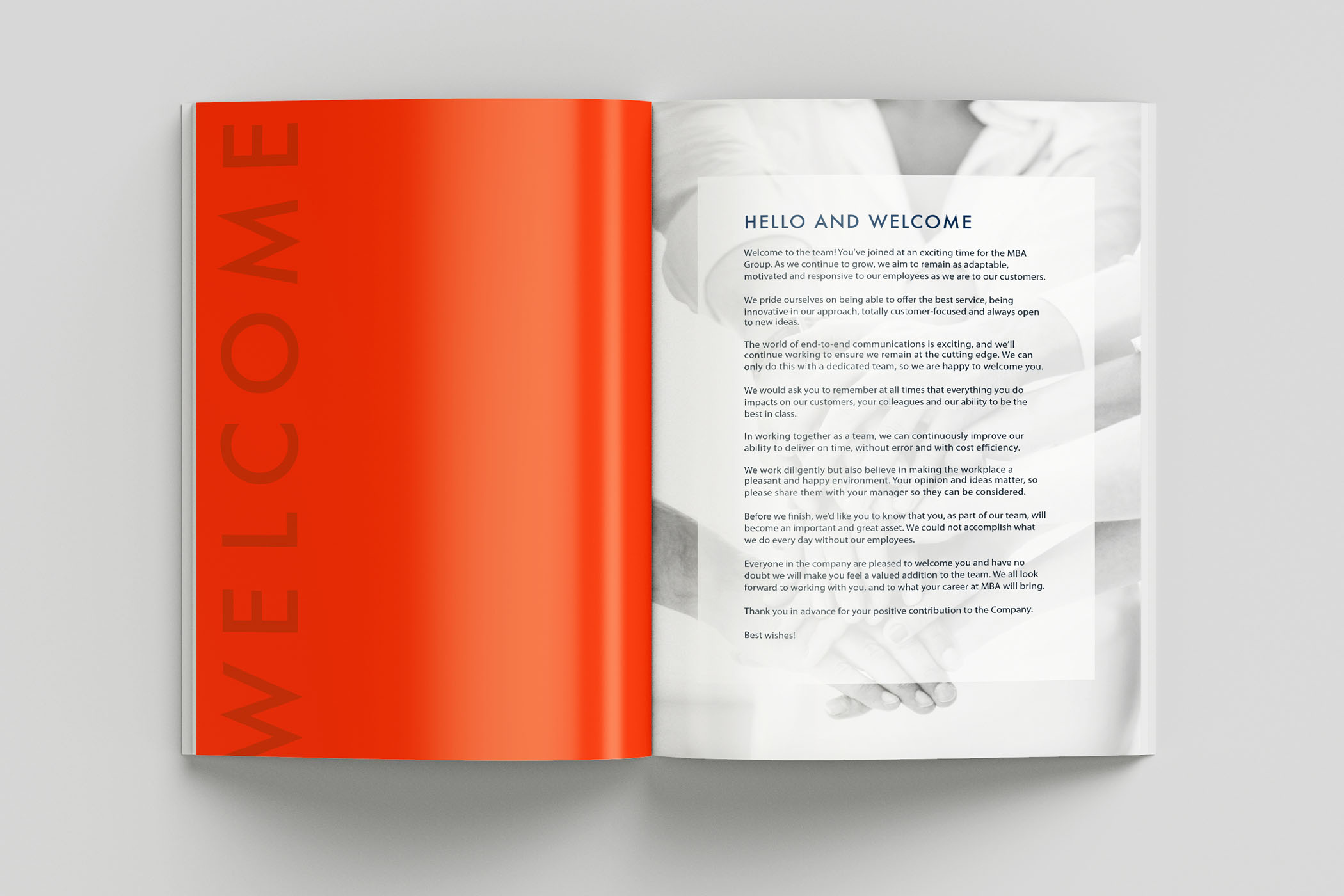
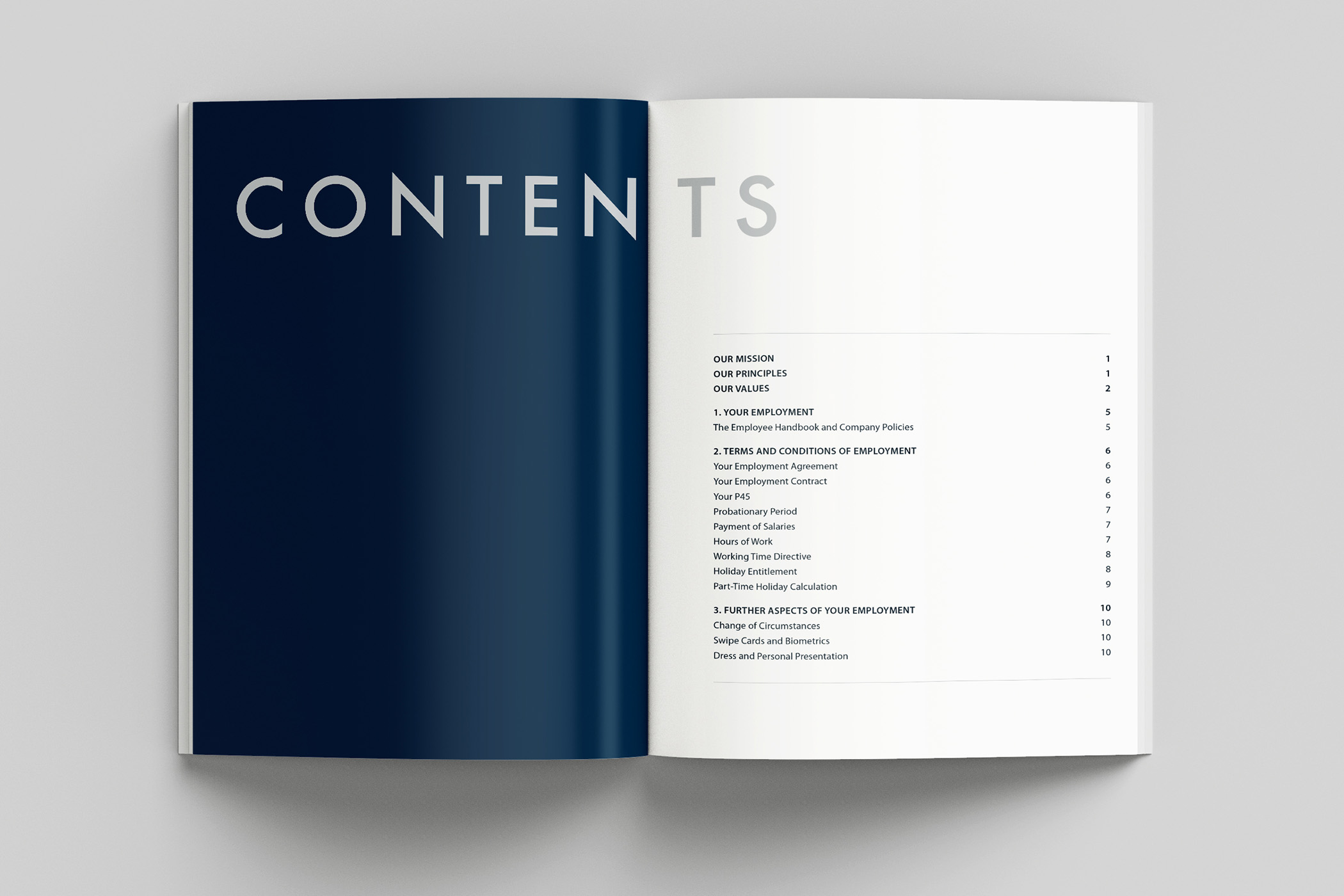


Finally I turned my attention to the cover: as with the content, it needed to be both professional and friendly, encouraging staff to read it, yet communicating a sense of importance. I used a lattice of triangles and diagonals to honour the brand’s triangular logomark, applied the brand colours, and strategically inserted staff photos on specific layers, communicating a busy but relaxed environment.
My A4 full colour mockup for an annual Bond Statement helped our team win the account with financial services provider One Family.


They were posed to roll out a new campaign aimed at customers with an unclaimed Child Trust Fund. The statistics were staggering: over £1 billion was estimated to be unclaimed by those unable to locate their funds. One Family would provide a service to assist in the search, and needed to get peoples’ attention.
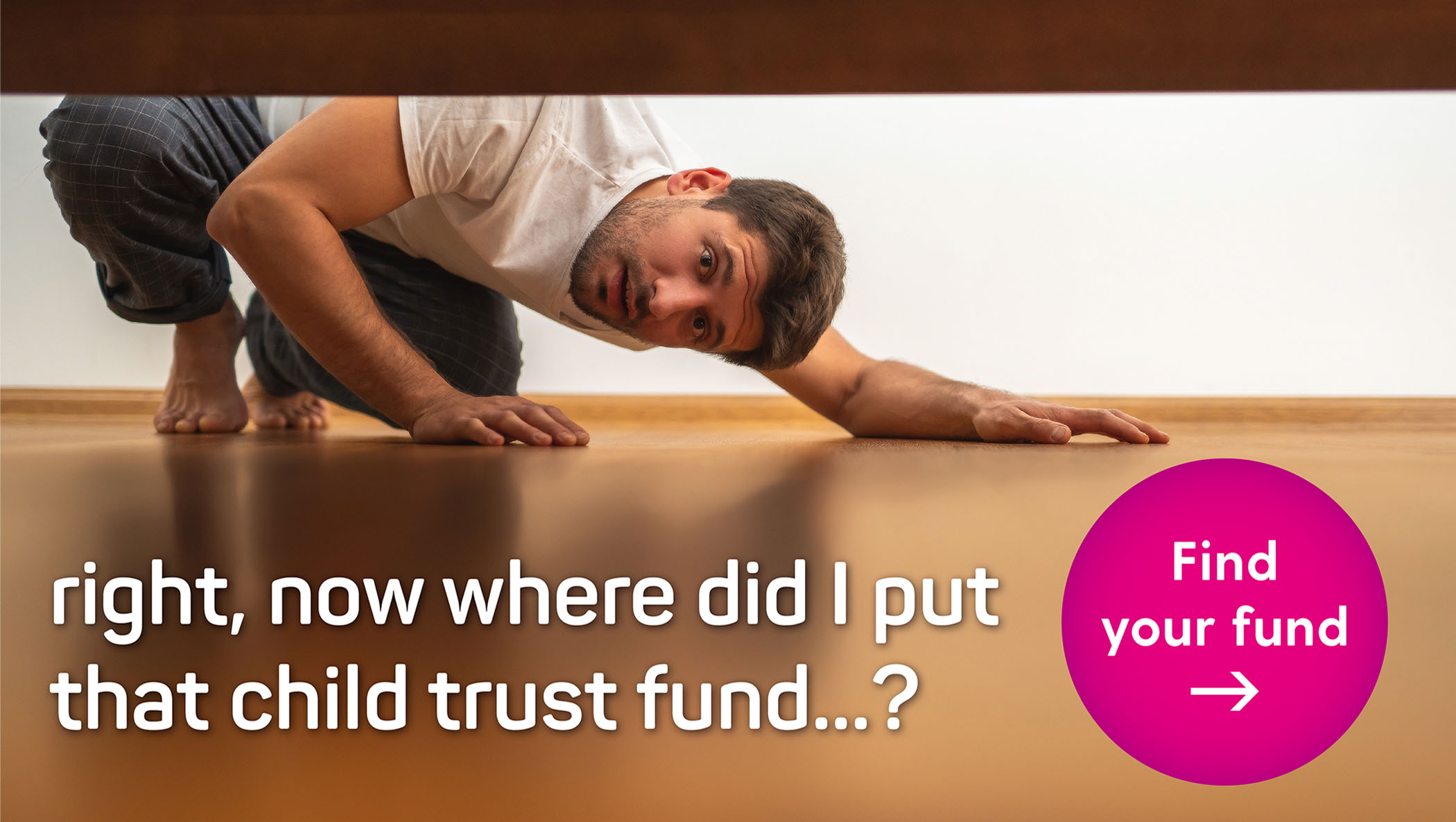
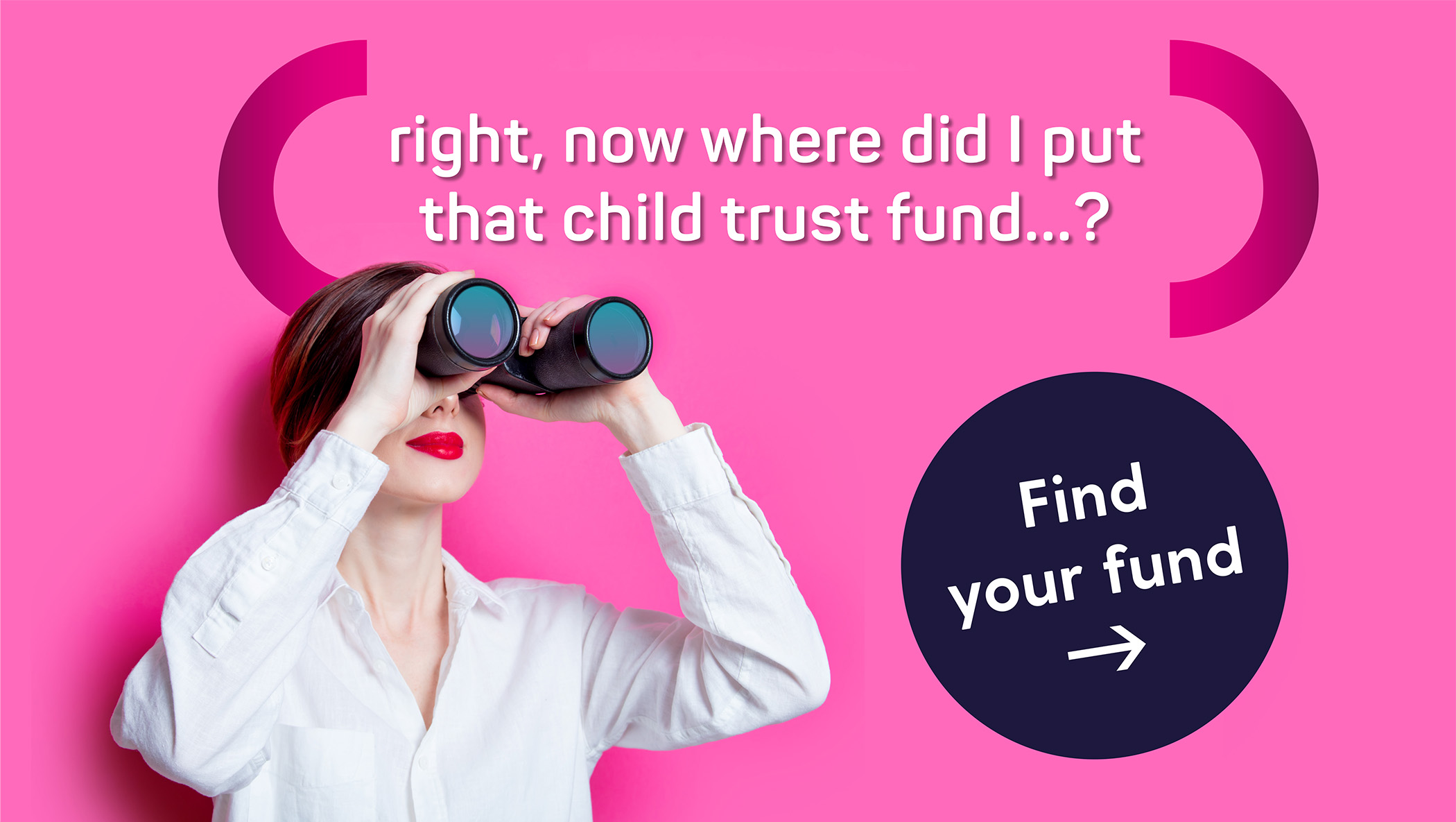
Our task was to devise a set of engaging Facebook banners to be run sequentially over several months, bringing the issue to light. We brainstormed and came up with the simple strap line “Find Your Fund” and the supporting copy “Right, now where did I put that Child Trust Fund?”
Then I set about creating the banners: after hunting for a more literal image of someone leafing through a dusty chest in a dark loft, I soon realised there was a lot more fun to be had by extending the metaphor to less literal searches. The half dozen banners I delivered brought a bit of wit to the campaign.



Have a look at some of my other designs below, including glossy pitch brochures with custom infographics and iconography, partner company branding ideation, 3D company Christmas card sent to all stakeholders, direct mail greeting cards and social media campaign.


