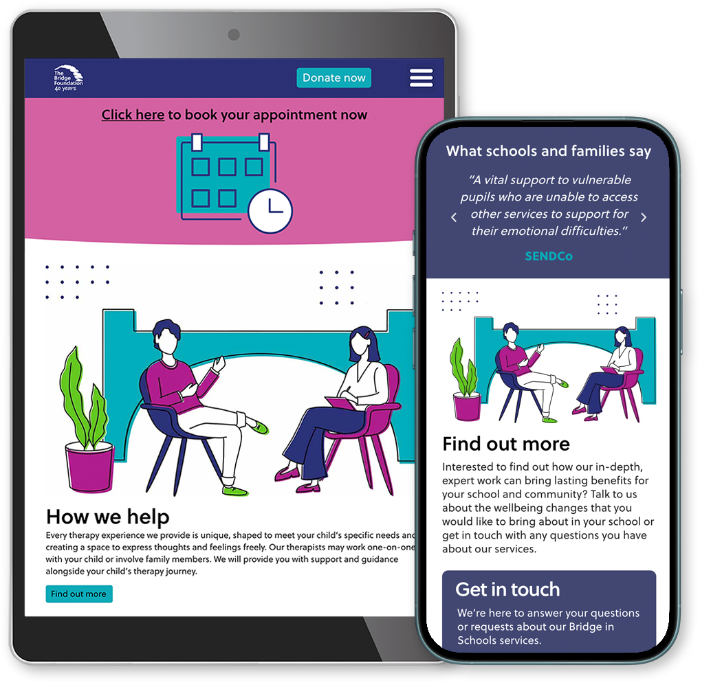
A well-loved mainstay of the Bristol mental health community, The Bridge Foundation has been making a positive difference to local children, young people, and adults for forty years. After a full redesign of their website they were seeking to match the new visual direction in their general marketing materials, and were looking for a designer to take on the challenge.

I worked with the head of Communications to commence a series of creative upgrades to steer their print publications, event graphics, social marketing and visual identity into a more polished place. Using several motifs from the website as a starting point, I conceived a more unified look and feel throughout the organisation’s communications, helping raise the visual profile and build their funding base.
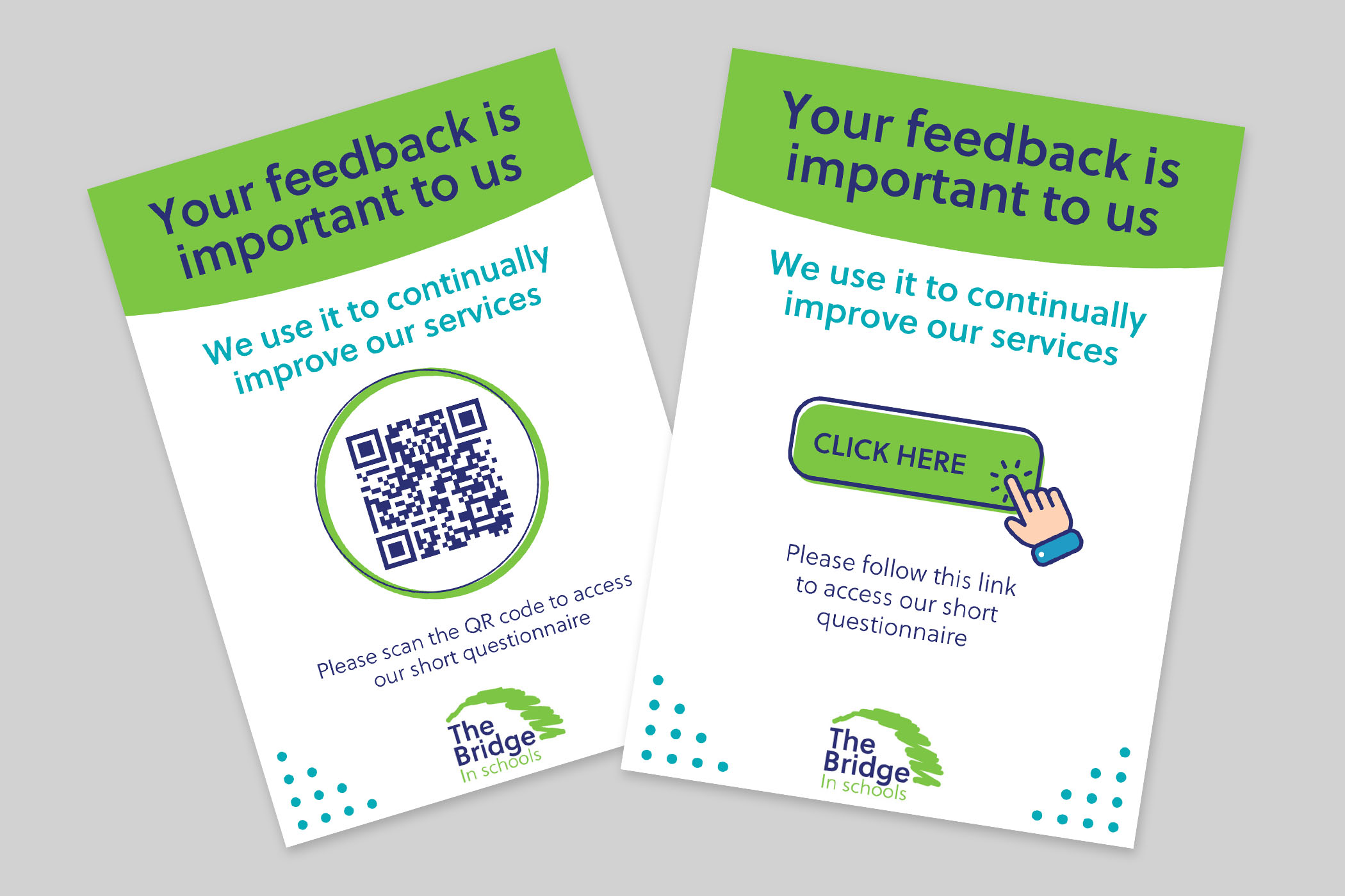
My first assignment was creating The Bridge In Schools feedback cards, to be made available in printed format as A6 postcards as well as an interactive version for email circulation. For maximum impact and simplicity I limited the palette to three colours and positioned the call-to-action centre stage, designed with the offset outer frame originating from the website’s icon set.
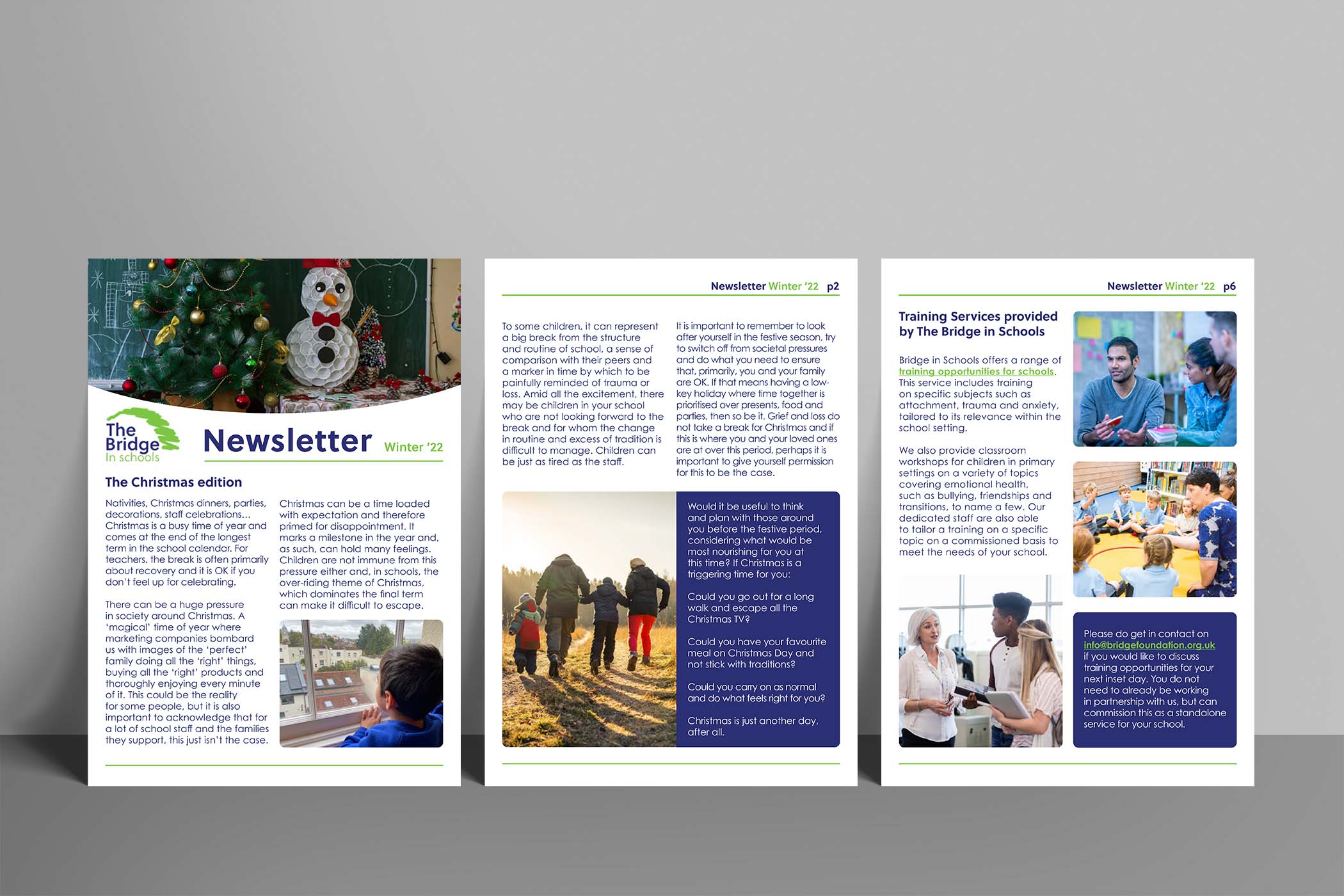
Next up was the The Bridge In Schools newsletter. The remit was to deliver an editorial template for future use by the in-house team. I aimed for a classic magazine style with only two columns, boxouts for actionable copy with the brand’s dark blue as background, key line borders for header and footer in The Bridge In Schools primary green, and extended the header curve to accommodate the seasonal imagery.
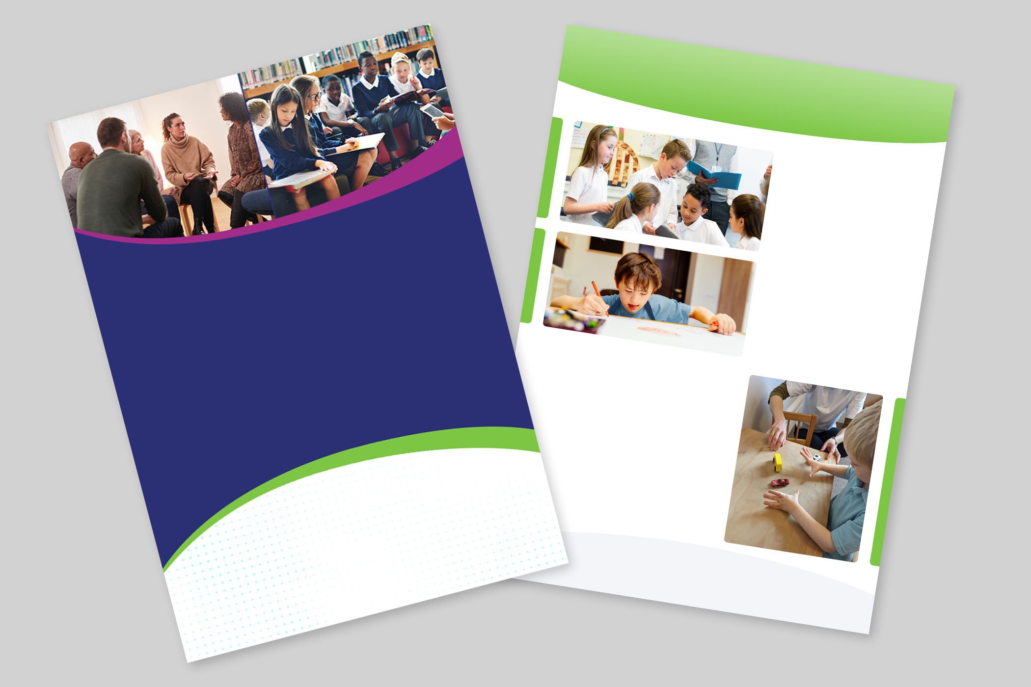
For The Bridge Foundation annual report cover, I further evolved the arc motif, using the primary dark blue as a strong background for the report’s title and edging the arc with brand colours for a three dimensional feel. The top arc then acts as a photographic support, and below the subtle dots motif is revealed.
Inside the arcs repeat as page header and footer, with a softened angle to preserve page real estate. For images I modelled a duplicate edge in single brand block colours to mirror photo shapes, suggesting a grid and setting the images firmly on the page.


I created three Instagram campaigns. ‘Moving House’ was first: I used in-house photographic assets to align the look and feel with the campaign’s more realist messaging.
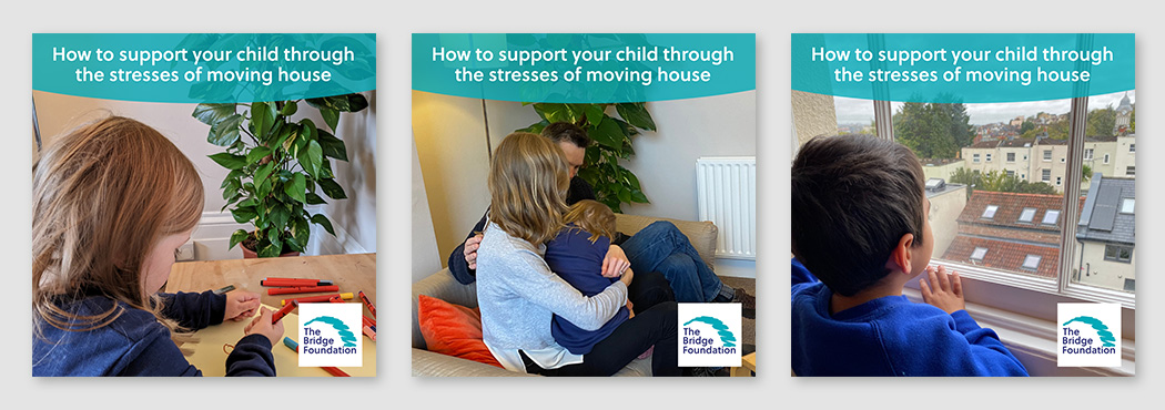
How to support your child through the stresses of moving house
The ‘New Arrival’ campaign’s sibling-focused appeal called for a more illustrative approach. I set the imagery against a brand-aligned dotted backdrop.
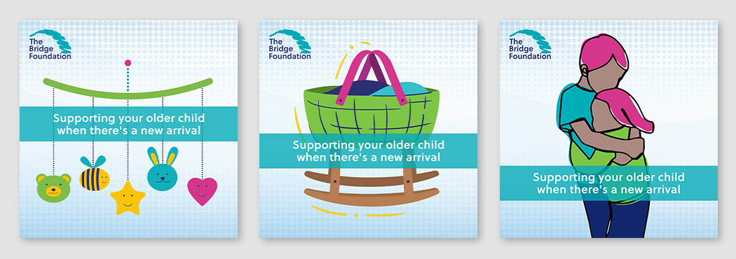
Supporting your older child when there’s a new arrival
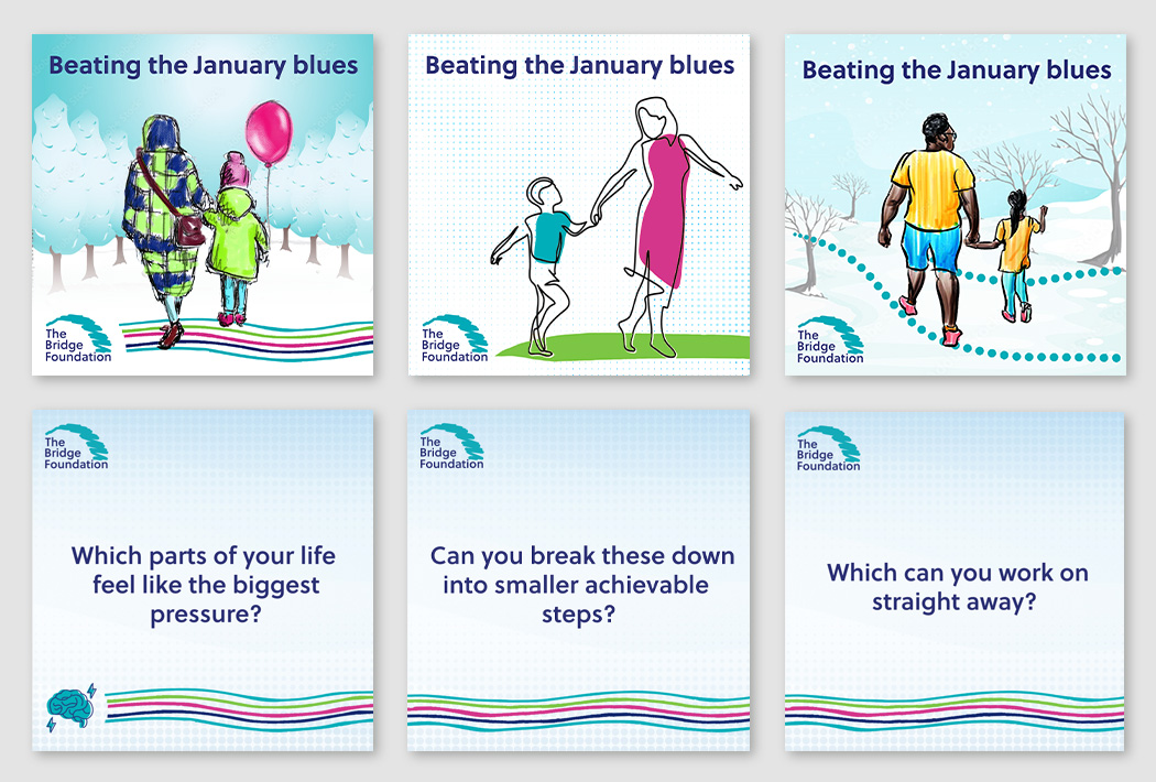
Illustrations also suited the ‘January Blues’ campaign with its positive messaging. The dots motif served again as a gradient background for the set of supportive questions, and I created a multicoloured bank of curved lines that meander like a river, guiding users through.
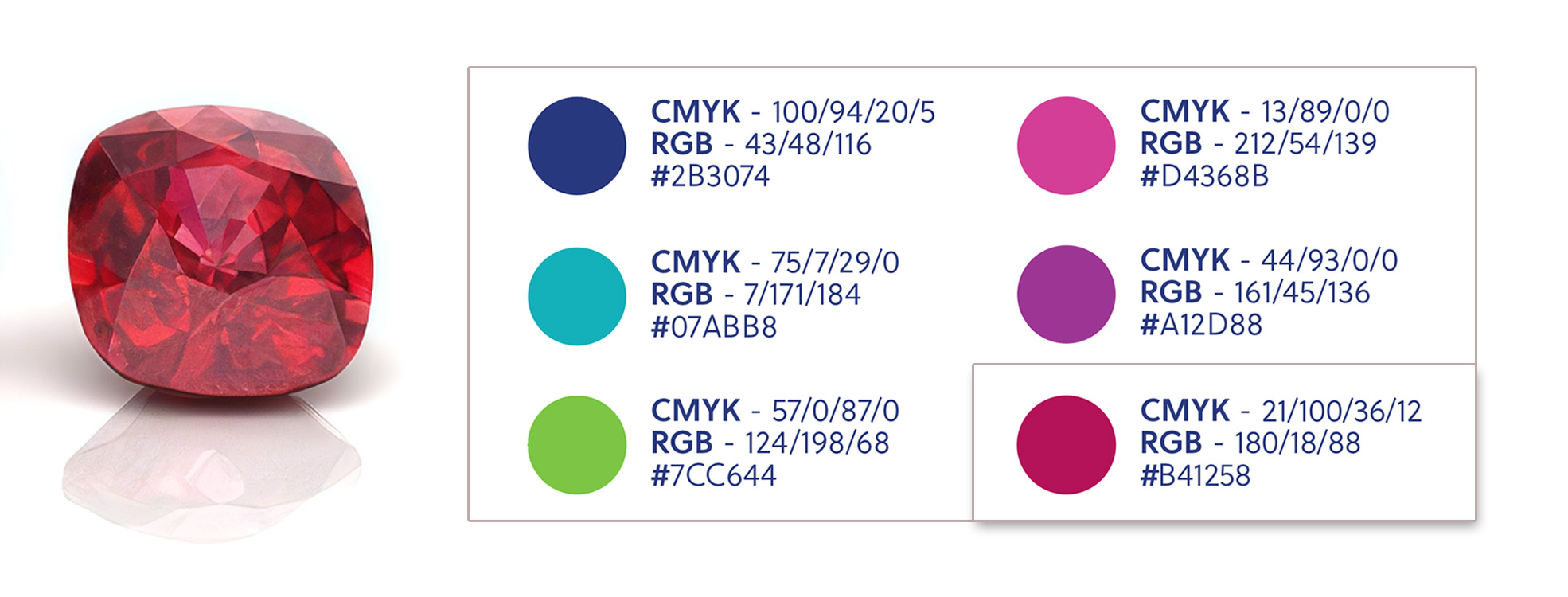
When The Bridge Foundation reached its 40th anniversary, I was asked to design an addition to the existing logo, including the simple phrase ’40 years’. A look at the 40th anniversary gemstone revealed ruby. I therefore proposed a new ruby red for the text colour to blend with the purple and pink secondary brand tones.
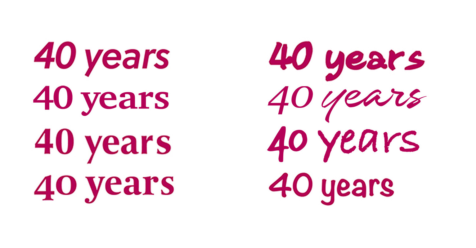
I then considered the typography, following two possible routes: 1) matching the brand font ‘Soleil’ or 2) complementing the hand drawn look and feel of the scribbled abstract bridge. I submitted a shortlist of options including two recommended Soleil pairings – Classico and Coranto 2 – and several hand written fonts.
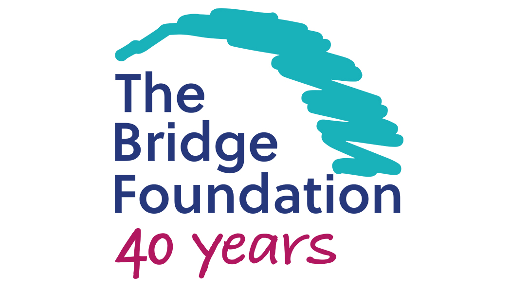
The board, communications head and I were all in agreement: using a hand written font for friendliness and contrast was the way to go, and our preferred font was Bradley Hand bold. I pulled the text into Illustrator, converted to shapes, fine tuned the lettering and adjusted the angles of the ‘y’. I matched the size to the existing text, extending to the inside edge of the scribbled arc / outside edge of the ‘i’ in ‘foundation’.
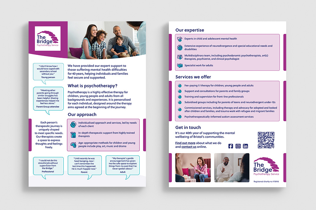
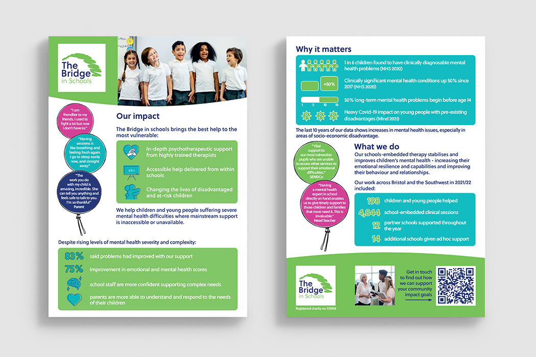
Among my other designs were the investors’ Impact Summaries, flyers and leaflets for therapy services and large roll-up event banners. Over three years the visual upgrade helped secure 680 extra clinical sessions and 5 new partner schools. Have a look at some of the designs below.